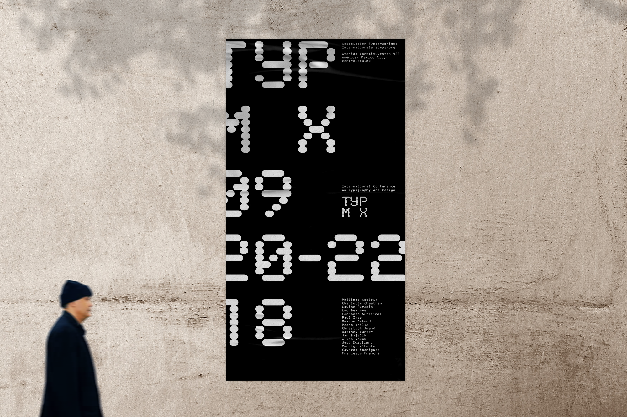
TypMX Brand/Graphics
2018
Graphic identity for a conceptual international typographic conference hosted in Mexico.
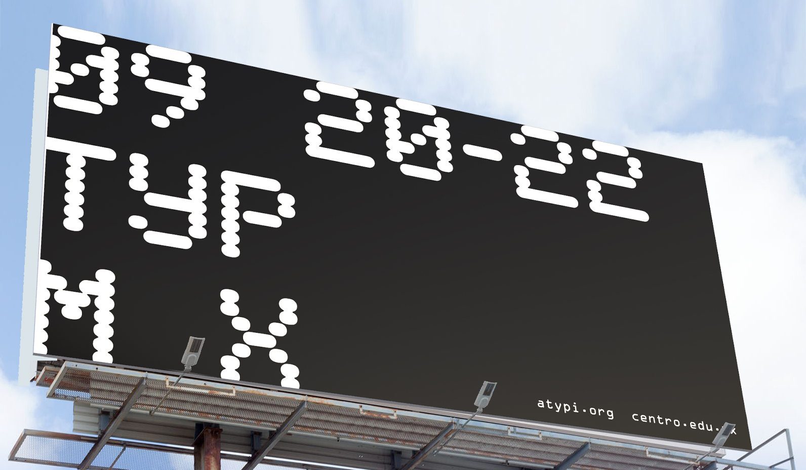
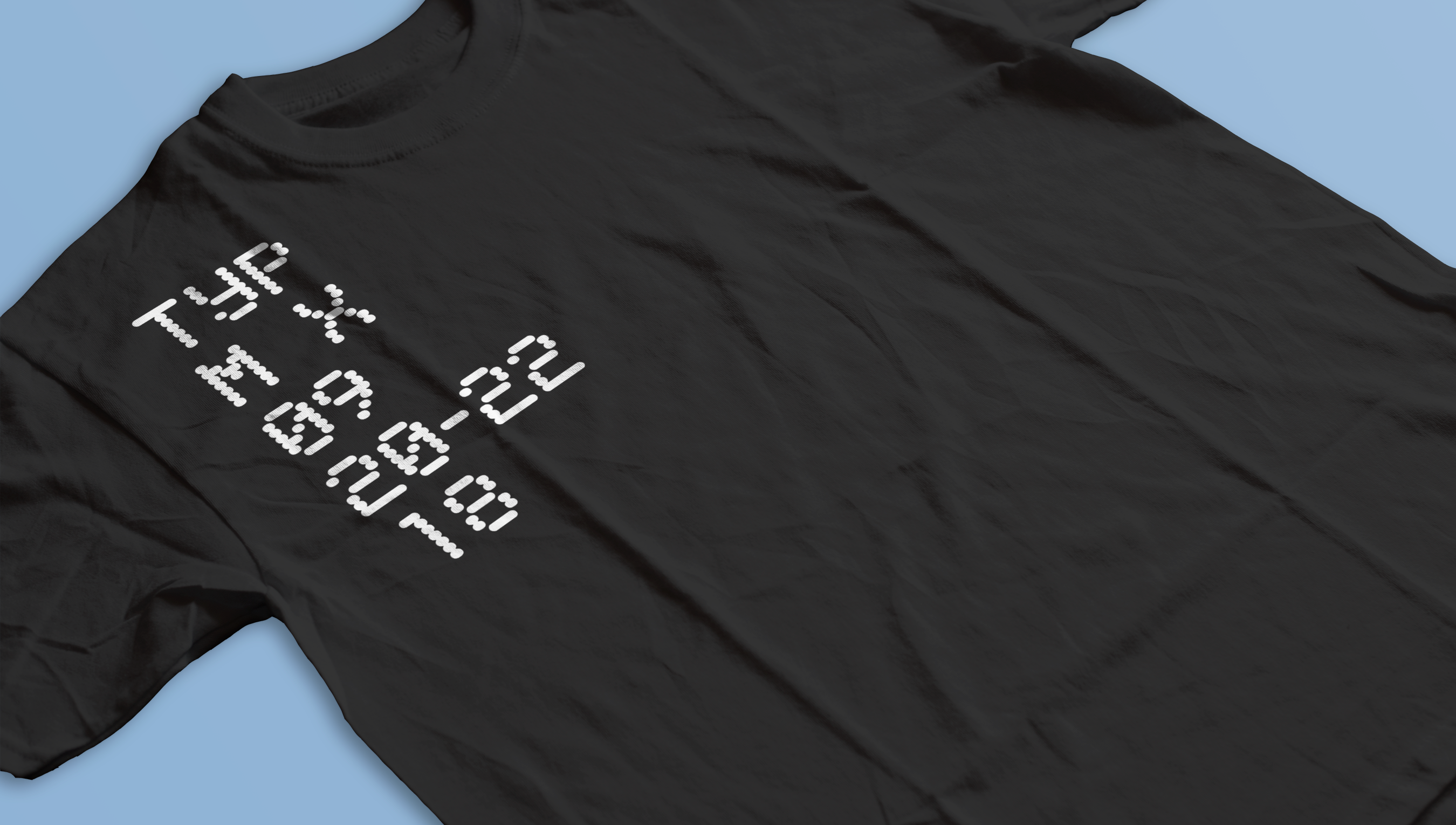
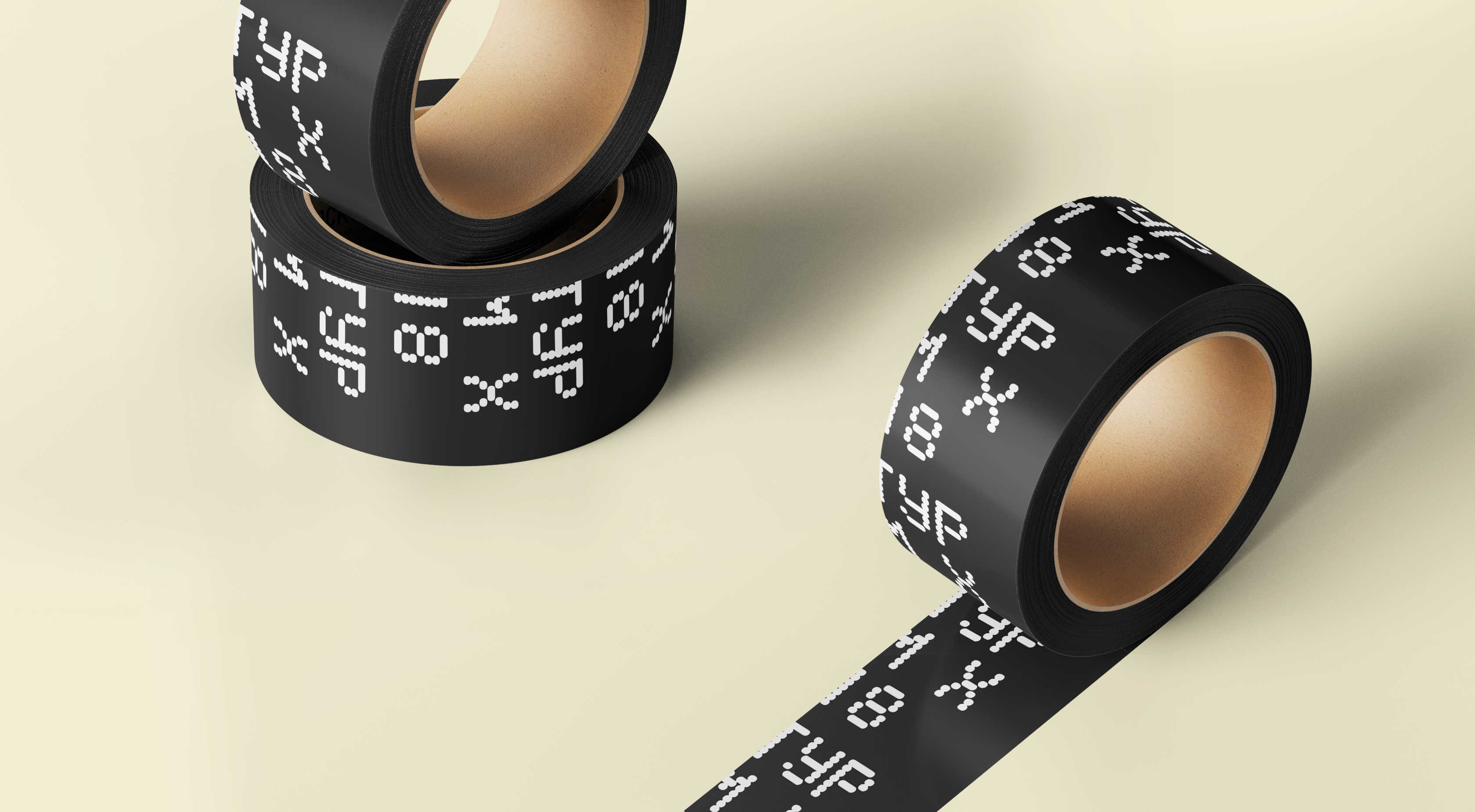
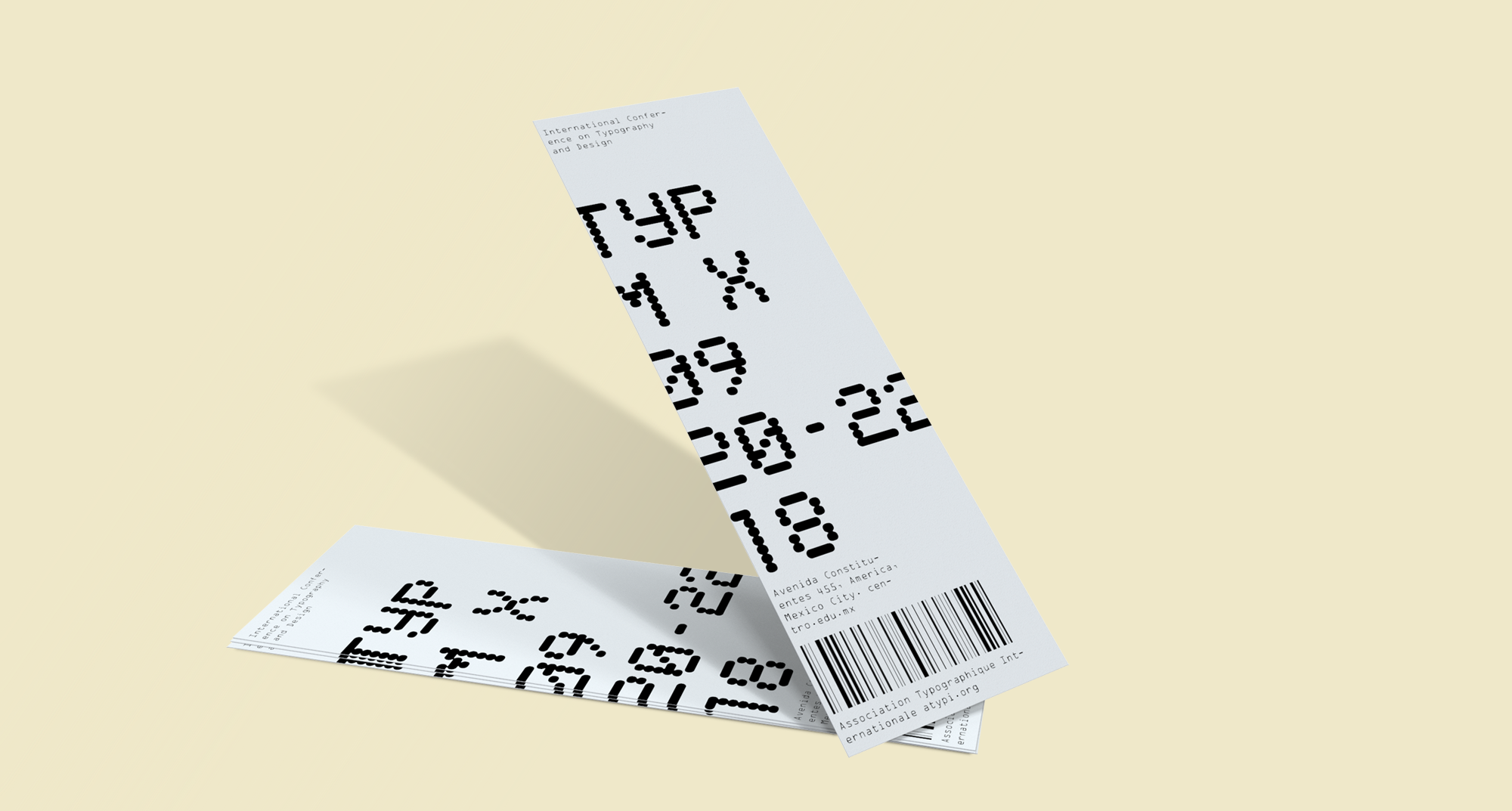
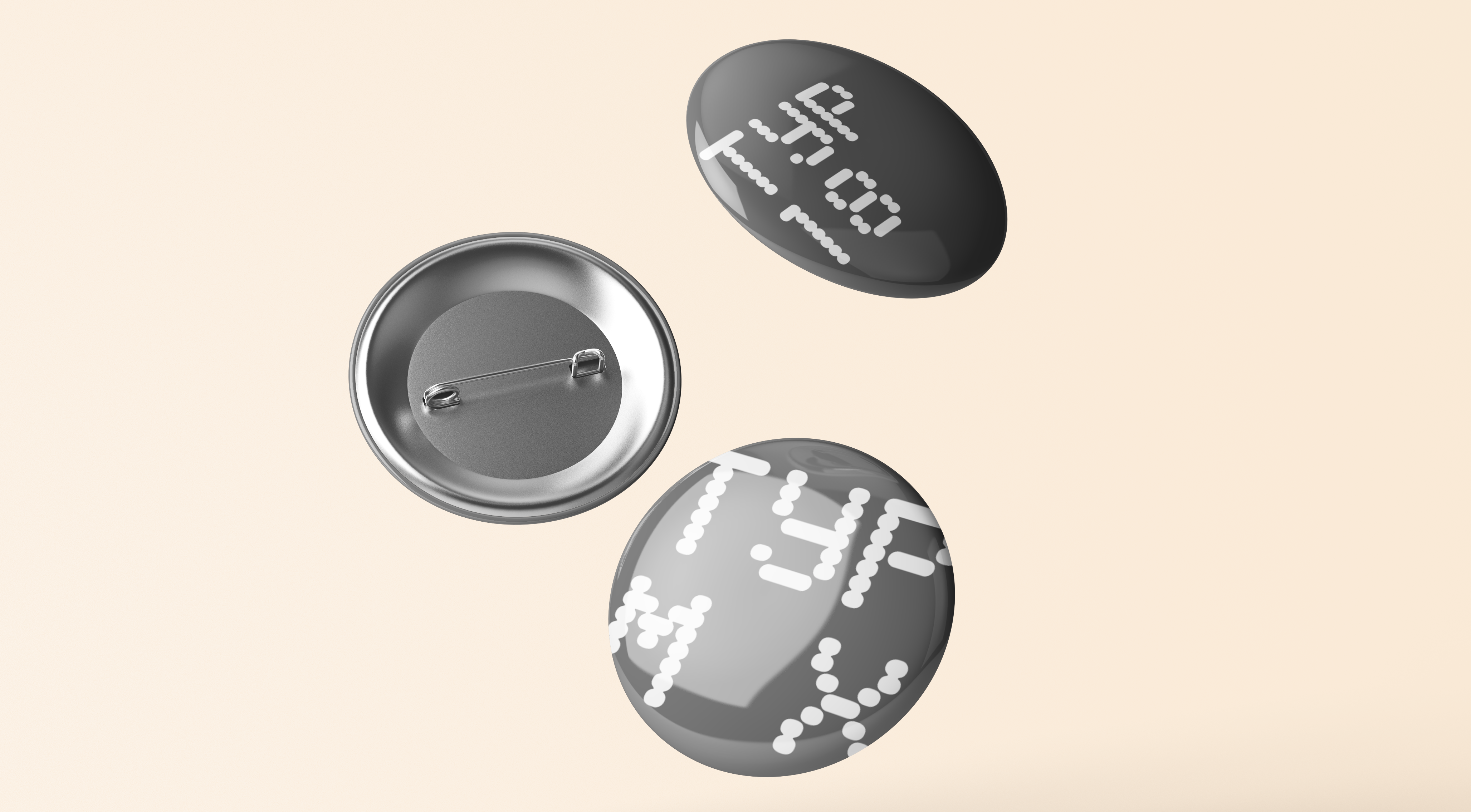
Typeface
TypMex uses OCR-A, one of the first computer optically recognized typefaces. I emphasized the typeface by using horizontal movement and digital motions. A few concepts are shown here.


Staggered Roll in
Individual fill in


Cursor wipe
Cursor row
Double back


Flat flipboard
Simultaneous shadow flipboard
Flipboard with Transitions
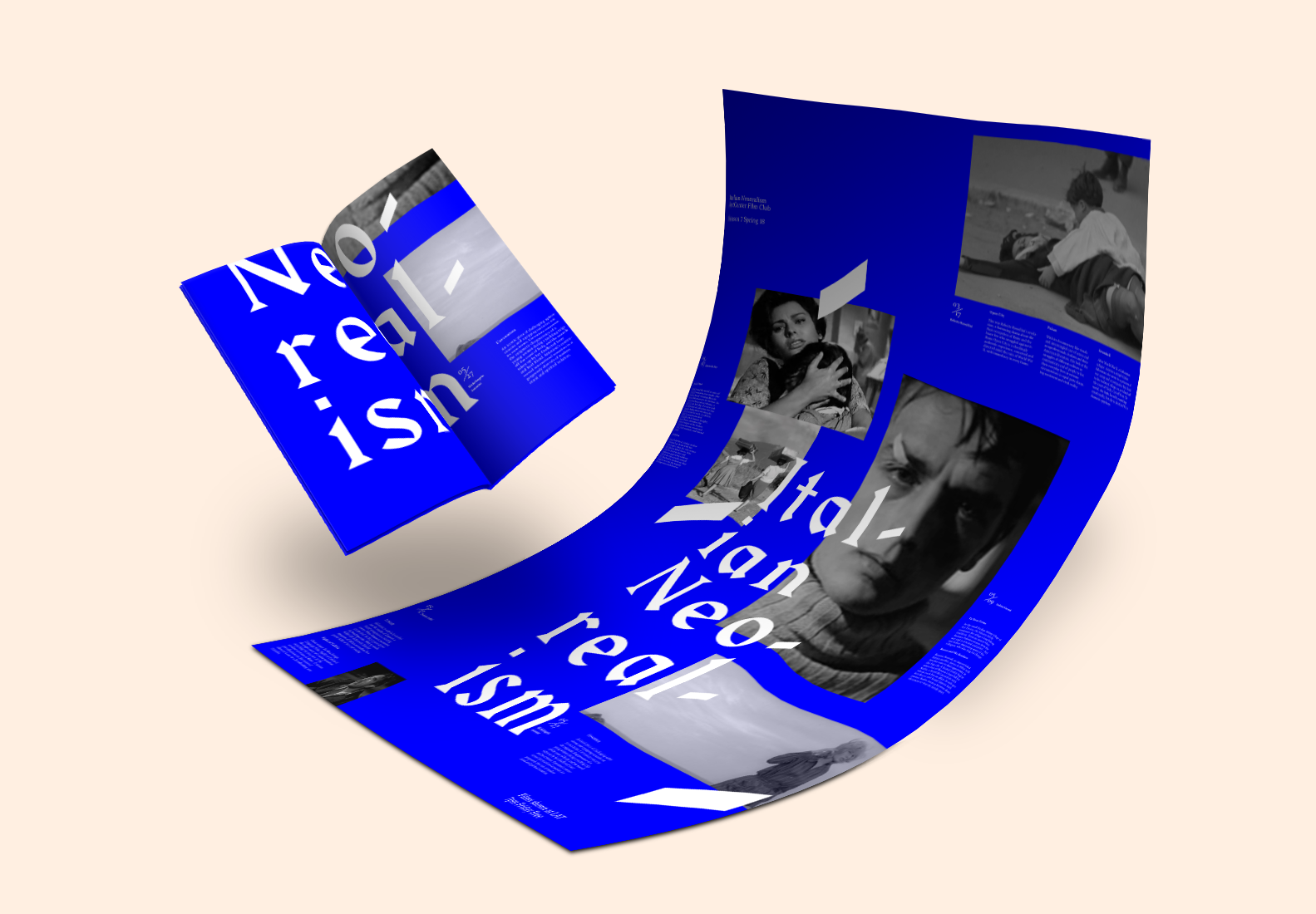
Neo-realism Film Club
2018
Film festival poster and french fold booklet. The booklet can be assembled by cutting the poster and french folding the pages. 2 Color printing.

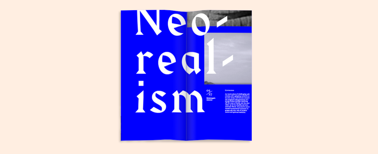
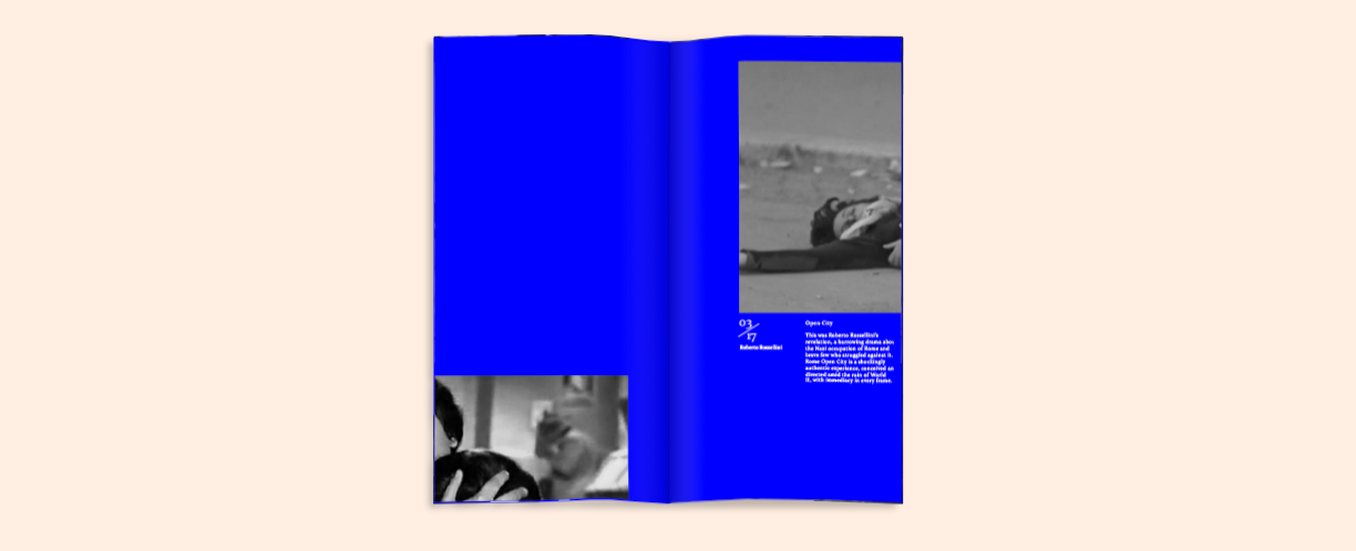

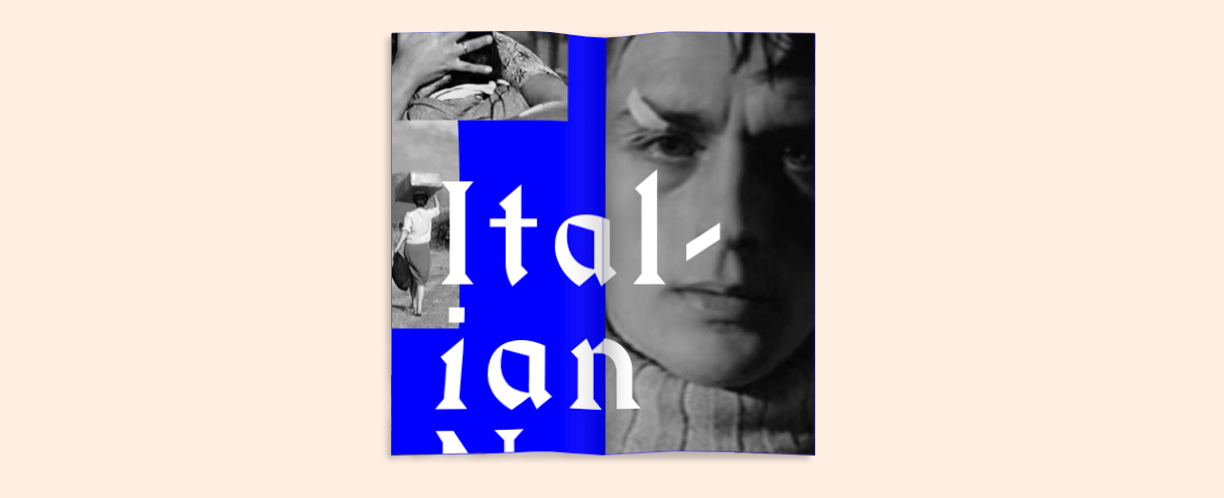
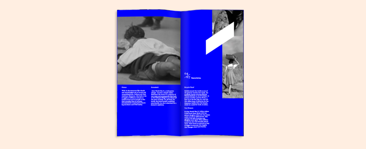

The recurring stroke motif symbolizes the films theme and Harbour, a latin and germanic style typeface, references political graphics of the time. The images are from the corresponding movies listed. The images are fragmented across the booklet pages, in line with the style of the films.

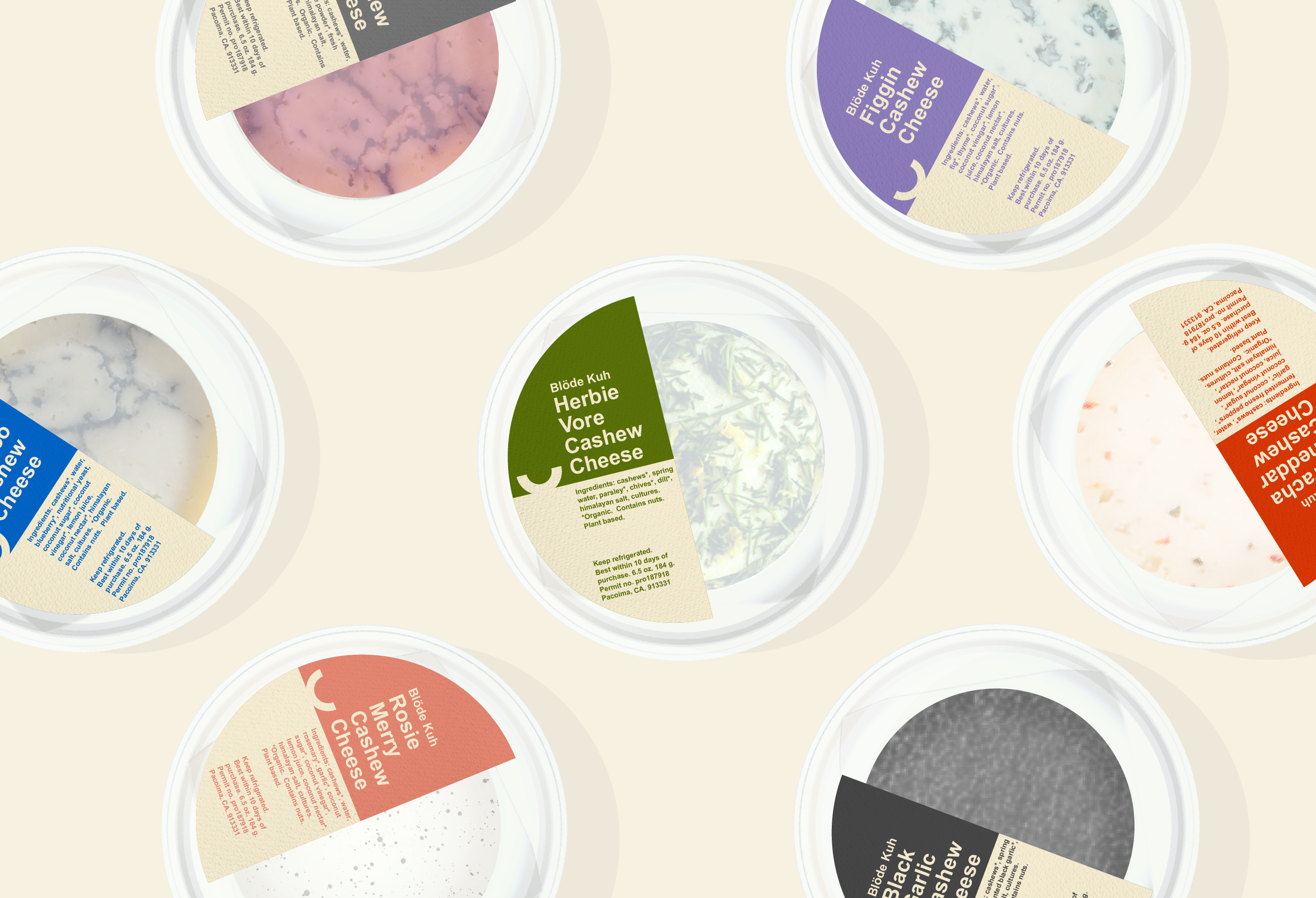
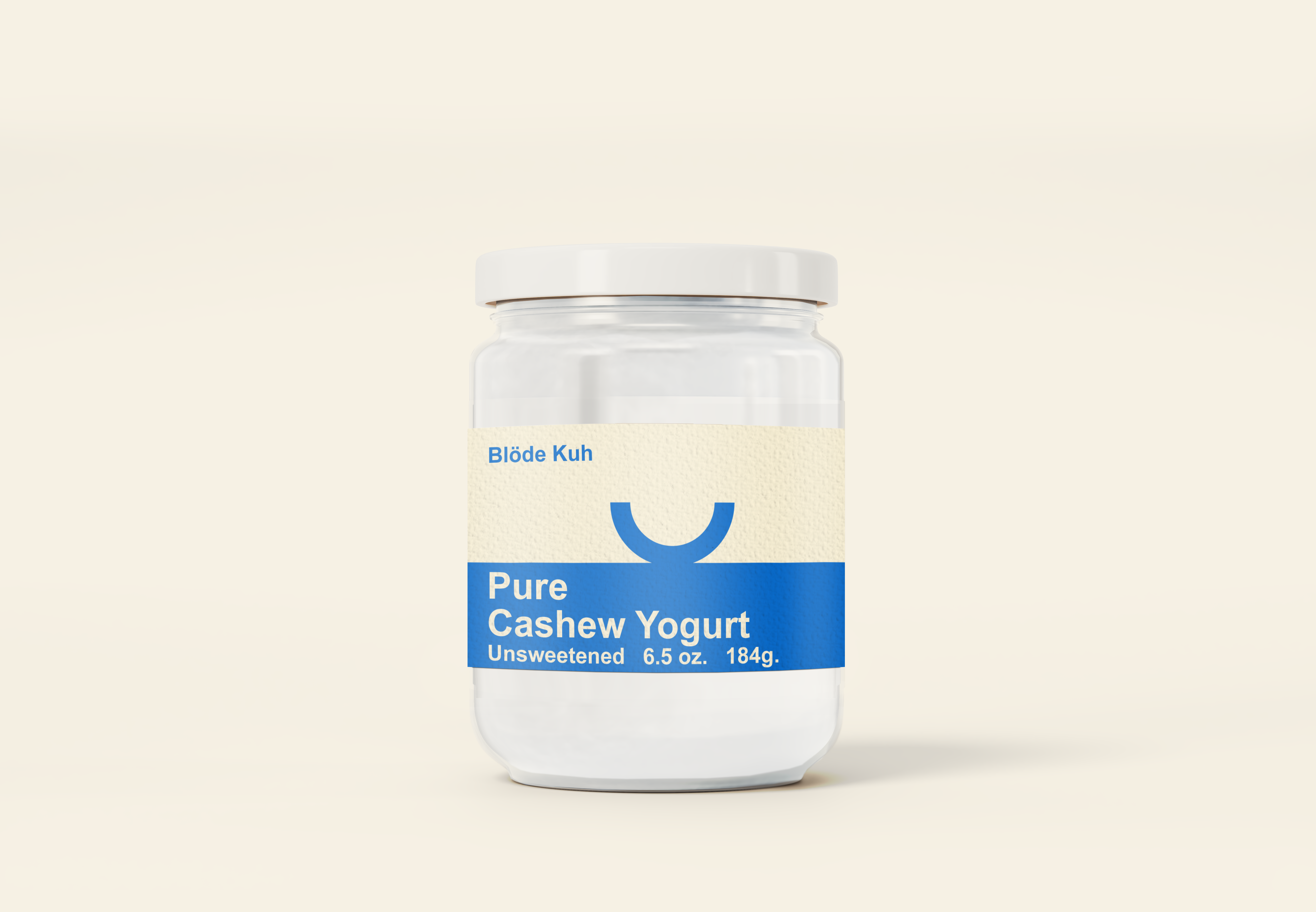
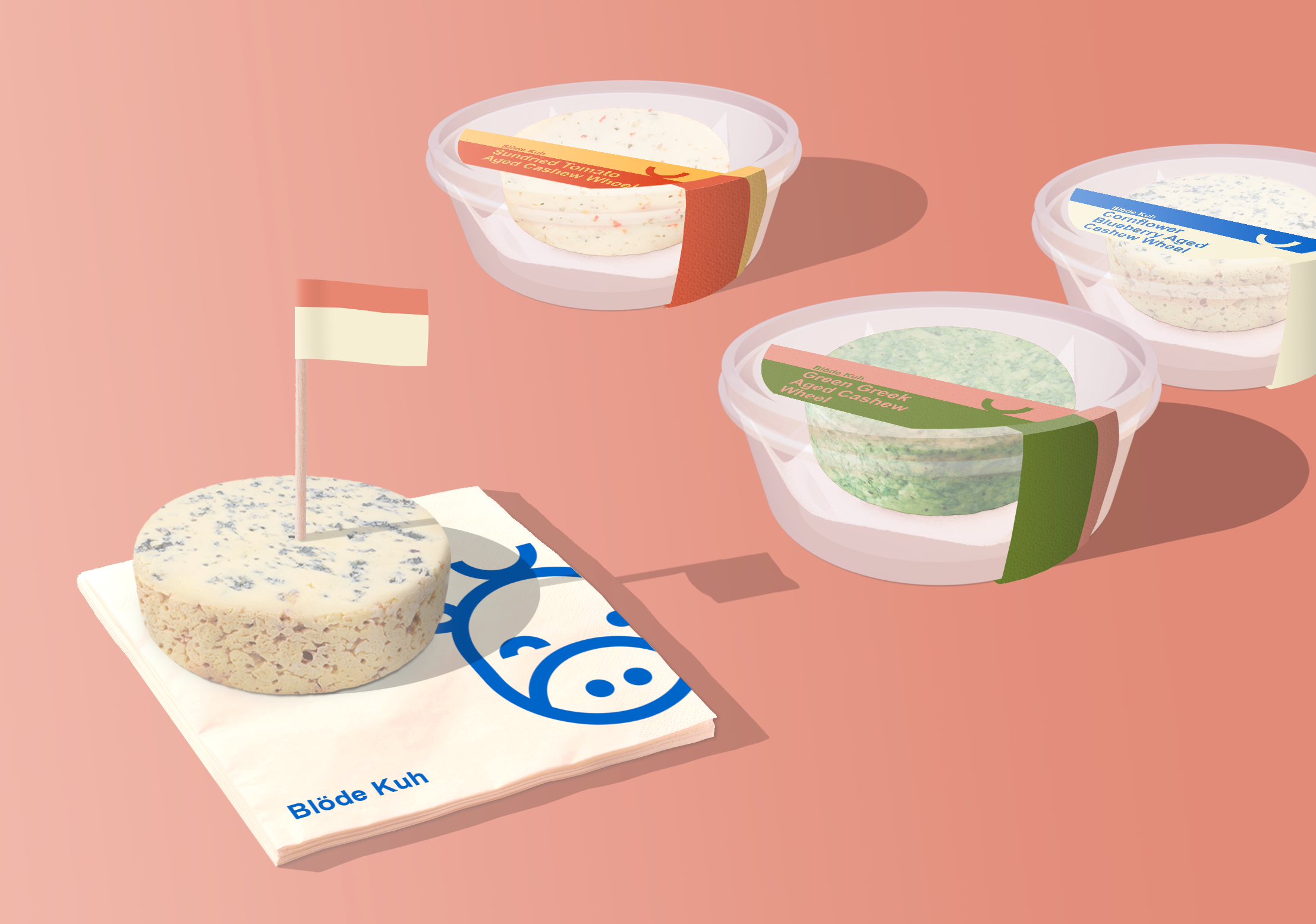
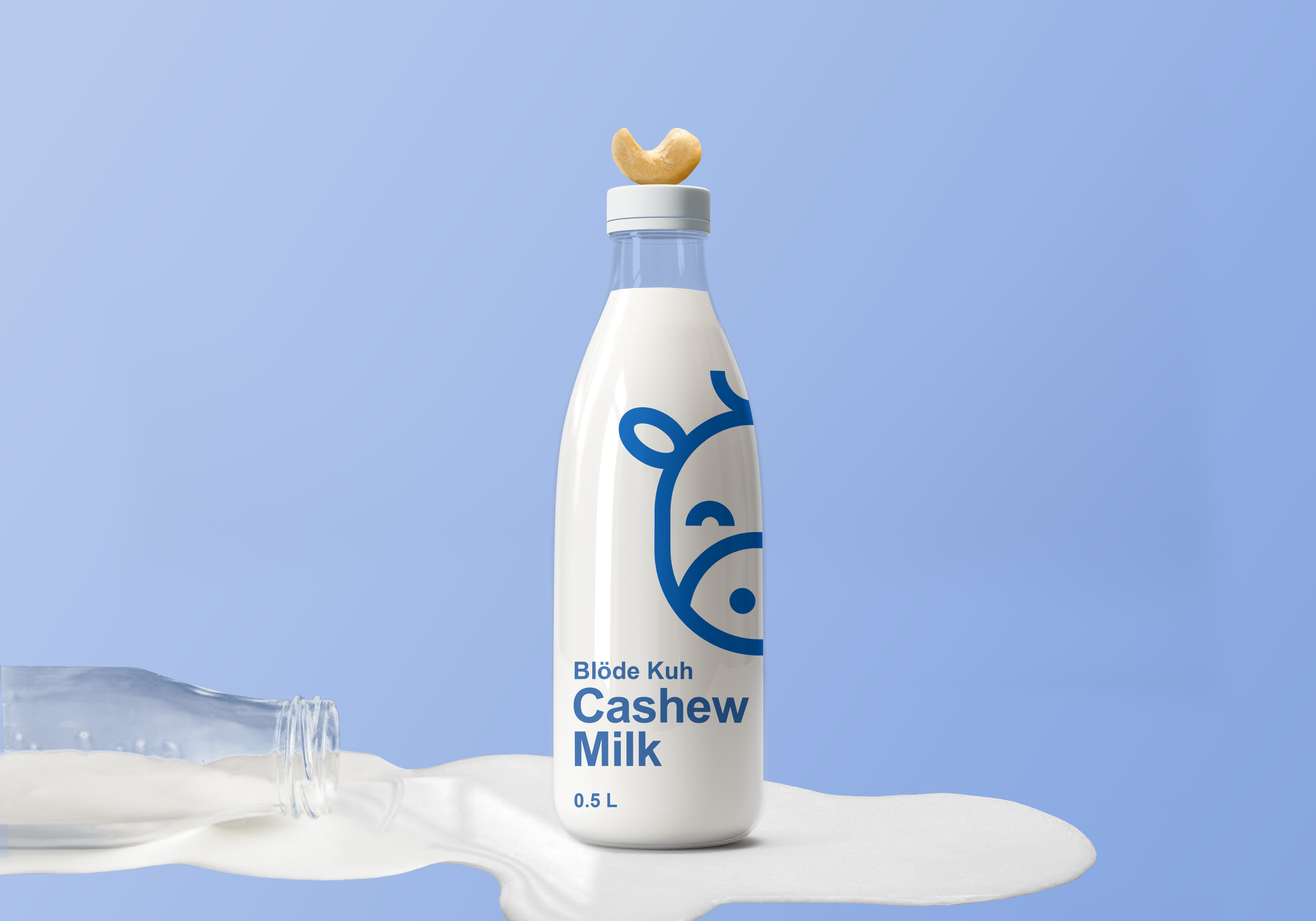
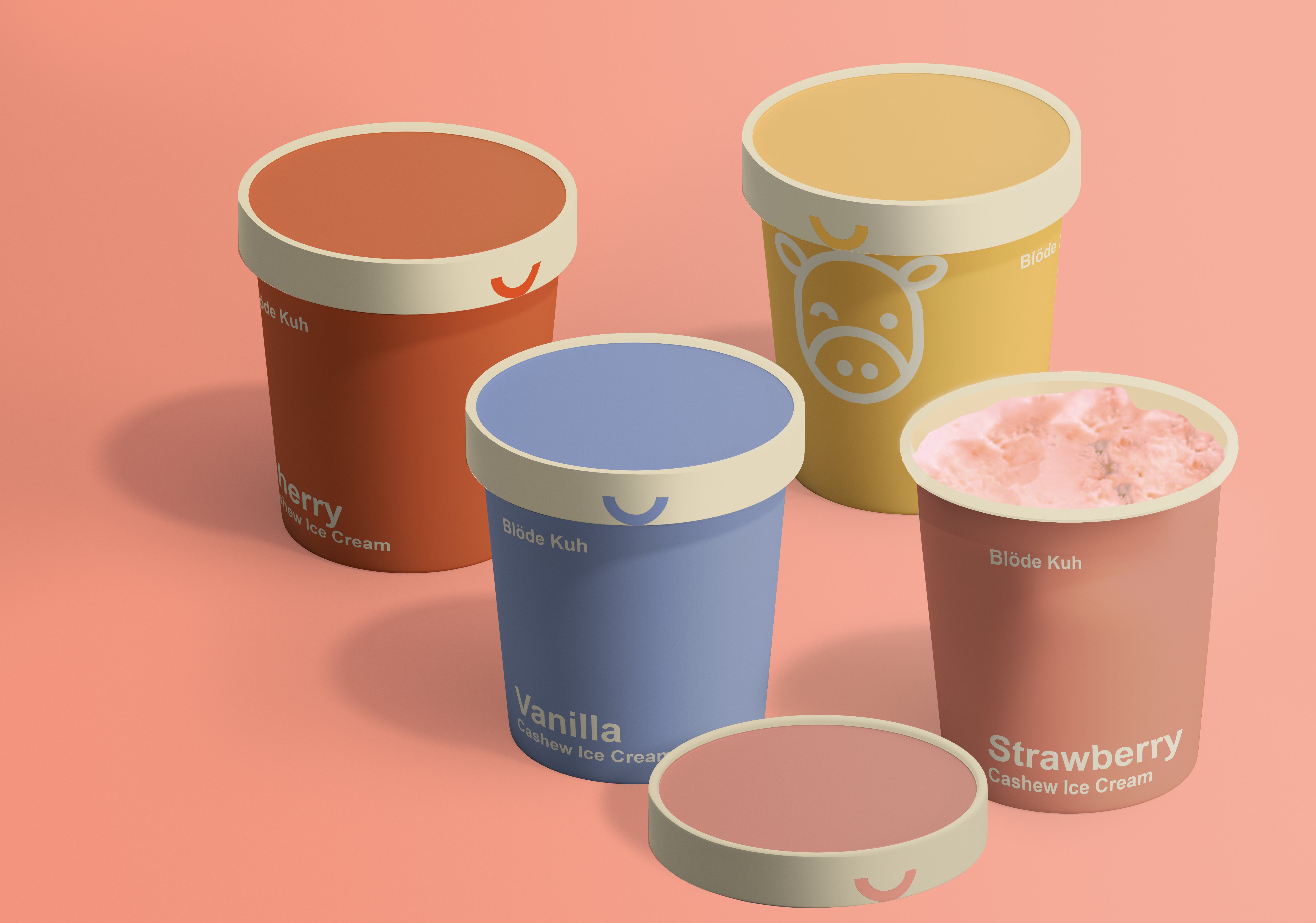
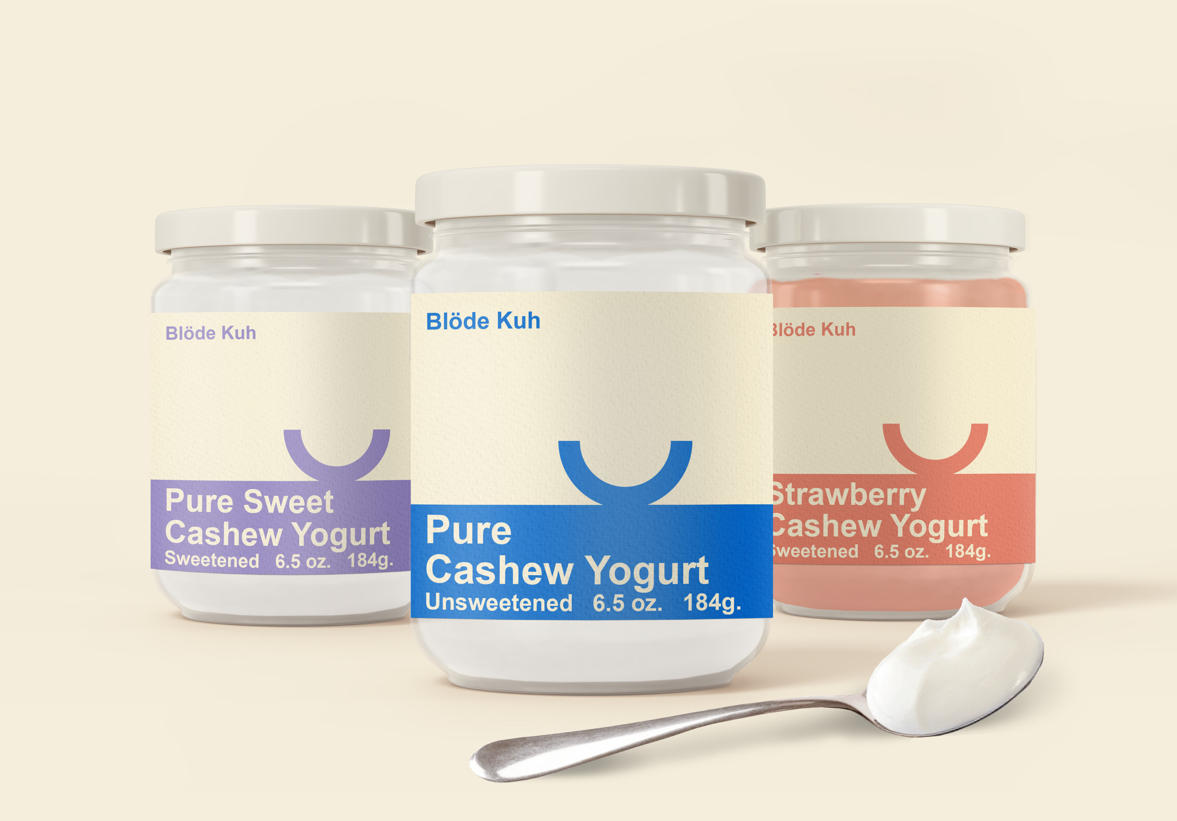
Blode Kuh Branding
2019
Branding concept for an irreverant vegan cashew cheese brand. Blode Kuh means 'silly cow' - the curved horn on the cow's head is a cashew.
Say hi through linkedin or email me at contact@saraferris.com All work by © Sara Ferris 2024